Logo Exploration
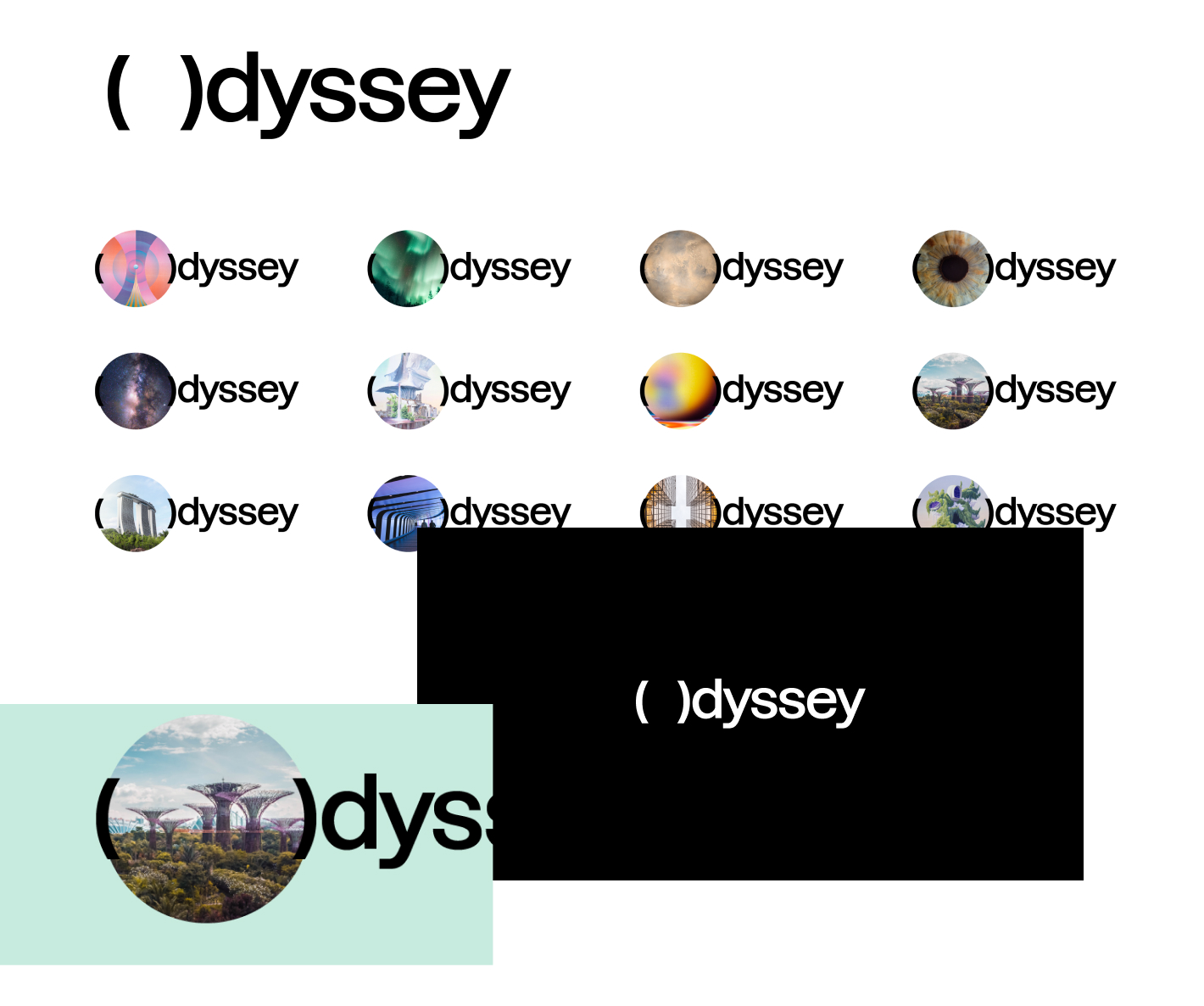
One idea was to show the 0 in 0dyssey opening up to reveal the breadth and depth of all the possibilities Web3 would create. They would be physical, emotional, and intellectual representations.
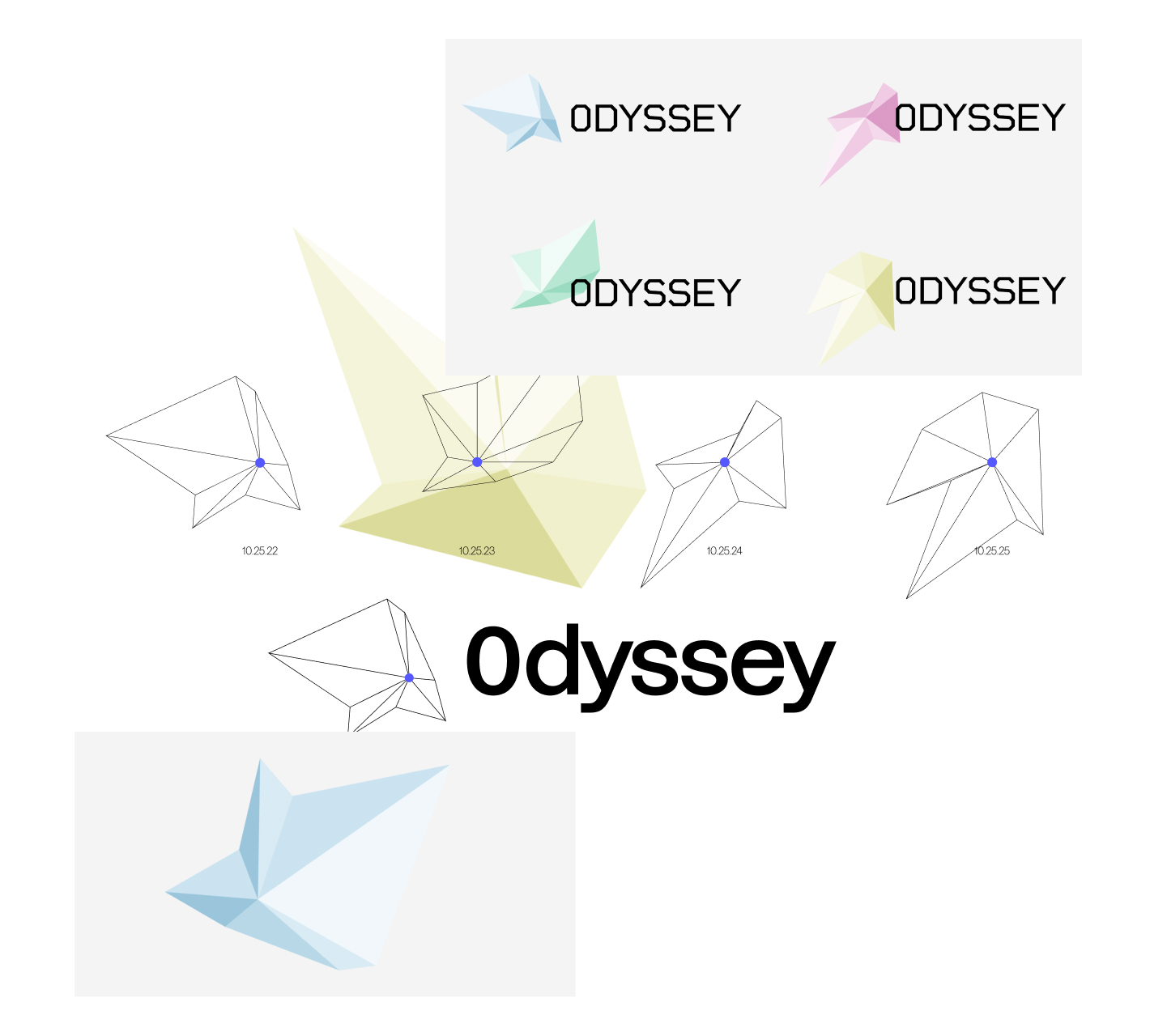
A second idea was to create an ever-changing logo that would match the planetary locations in regard to Earth. The logo would be slowly and subtly changing as it tracked the location of each planet. The blue dot in the logo is a representation of Earth while each vertex is a representation of the other planets. (Yes Pluto was included.)
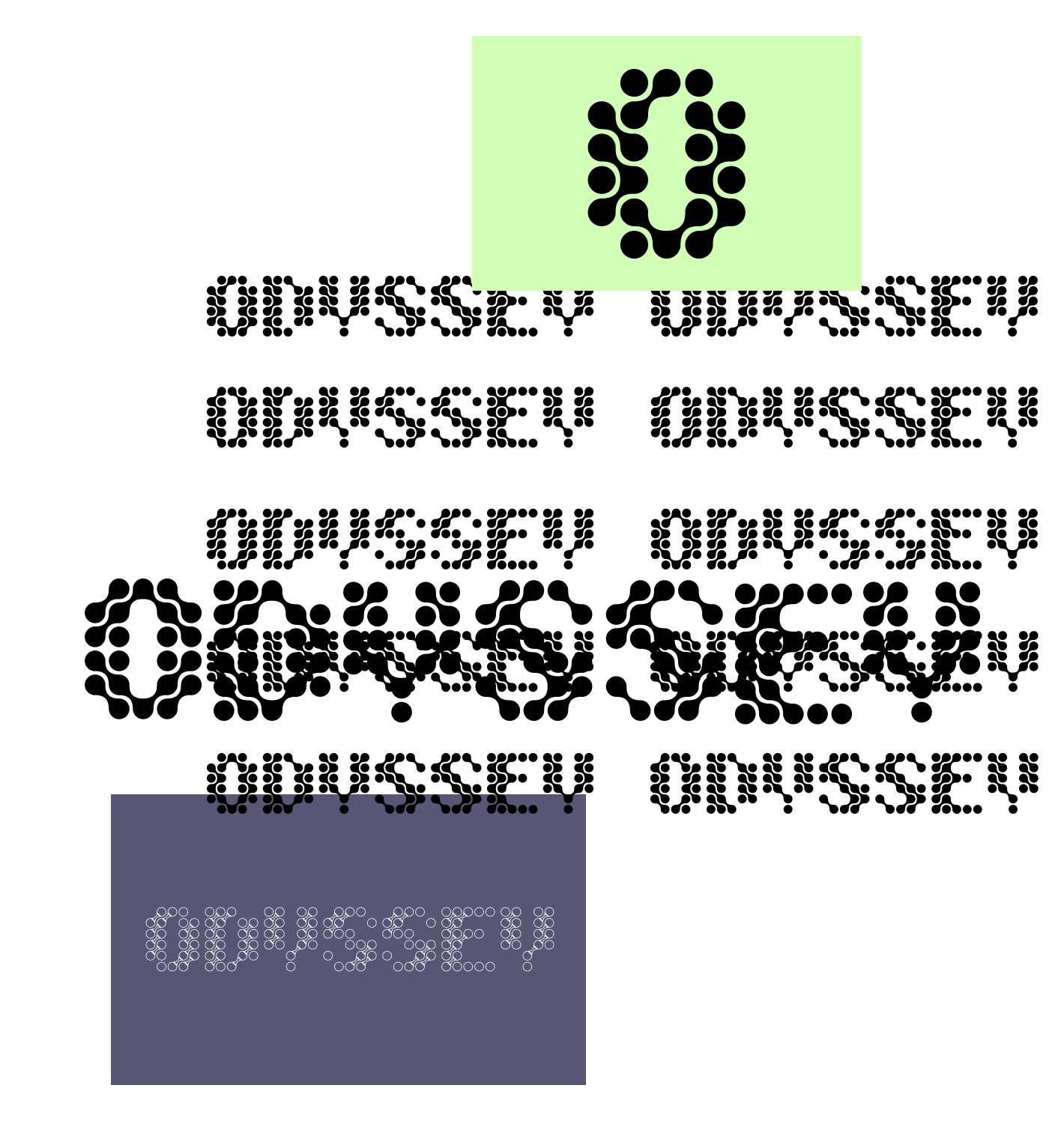
A third idea was inspired by 0dyssey’s mission to create a network of Web3 professionals and experts that were connected and constantly helping each other out. Each dot in the logo would constantly change which neighboring dot it would be connected to.
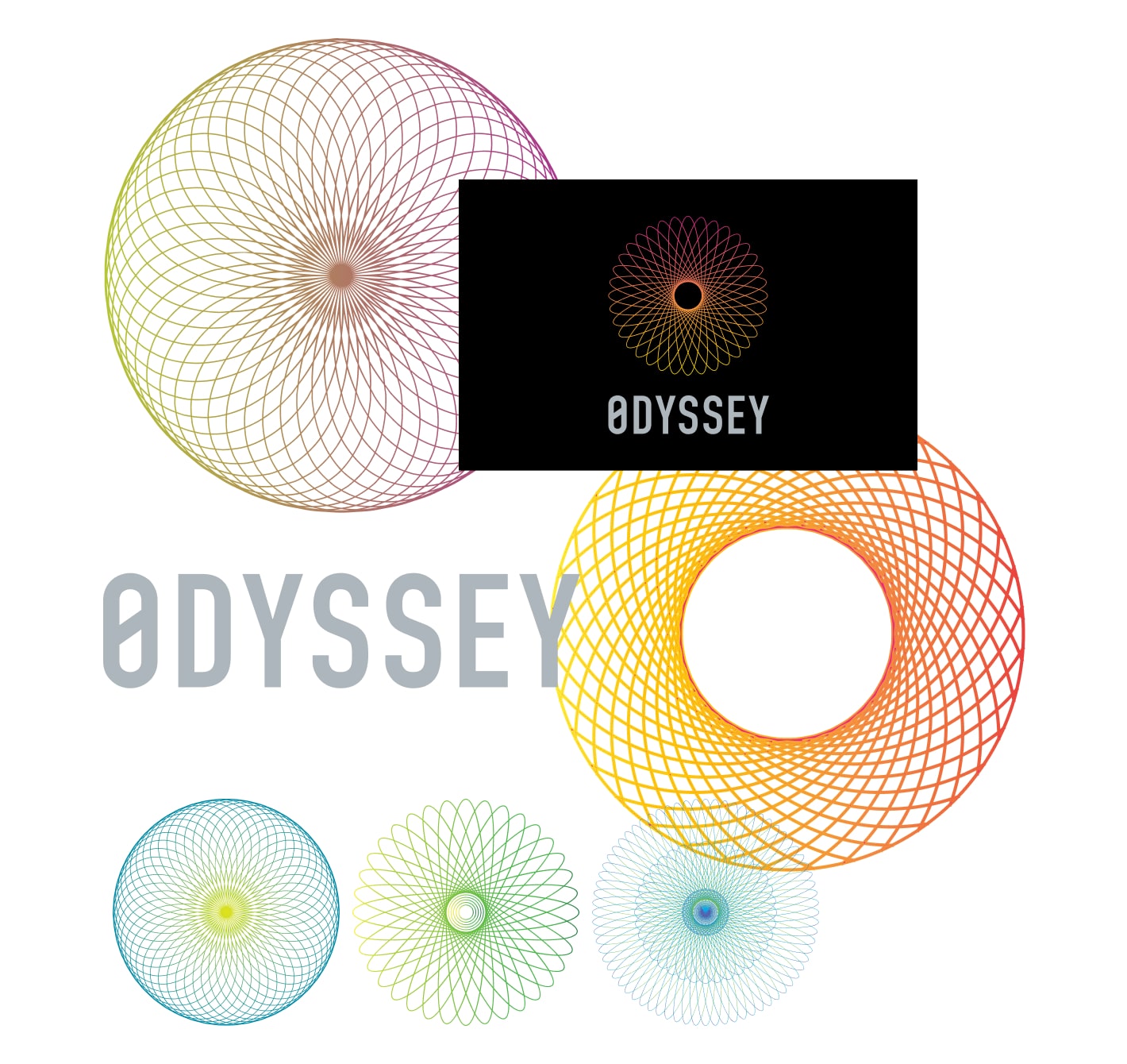
The selected direction was using a spirograph that would continuously change as a representation of the soul of 0dyssey, an ever-changing entity that would be shaped with each new Web3 expert joining 0dyssey’s network.
Logo Refinements
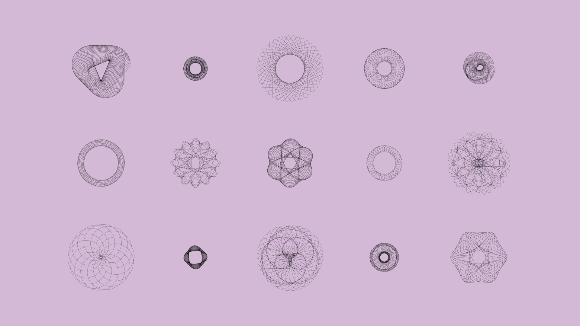
An array of static spirographs were created as line width and density of the shape was explored before setting off on an animation exploration.
The animation exploration looked to see how a spirograph could change and morph into different versions. The guiding question through this was: Does it feel and look like a breathing soul? Answering yes to this question allowed for an ever-changing logo to feel like it conveyed 0dyssey's state: a Web3 hub that is always shifting, never static, as new resources and people are added to their network providing new expertise and ideas.