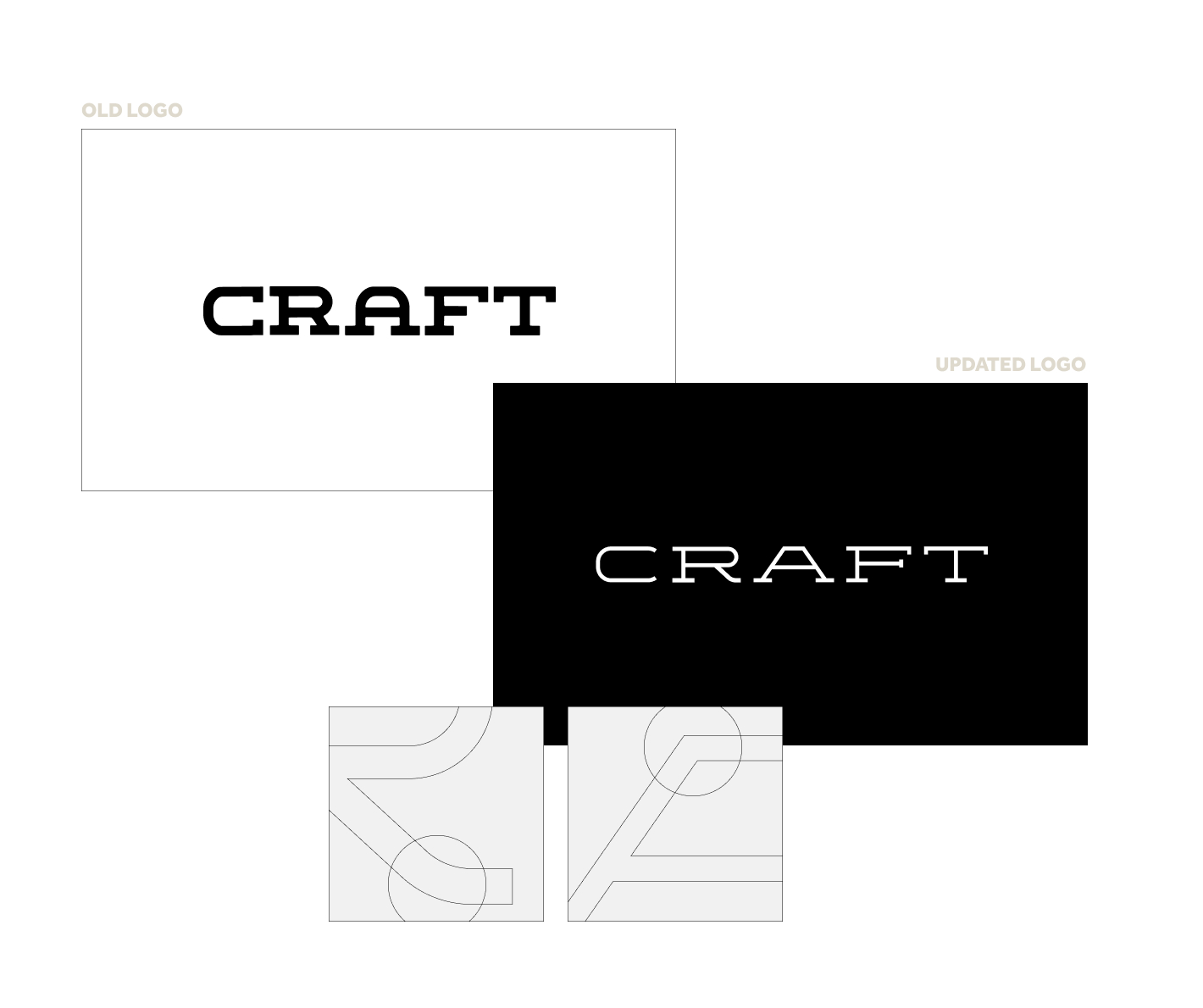
To help refine their current brand, updates to the logo were made. The new logo kept the same serif wordmark approach but changes to it’s weight and width allowed it to be polished so it exemplifies the refined and final state of the start-ups that go through Craft's highly-involved process.
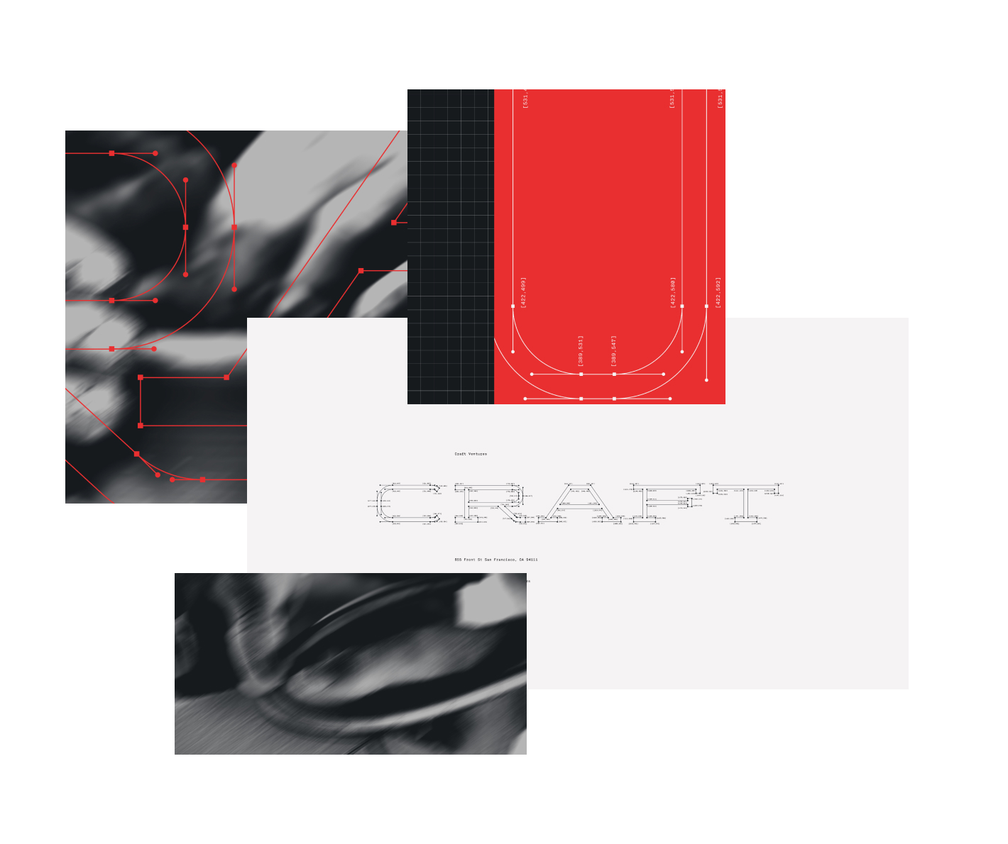
Additional details, such as the angular A and the kickstand on the R, allow for a unique wordmark that help further prove the attention to detail Craft has ensured within their approach.

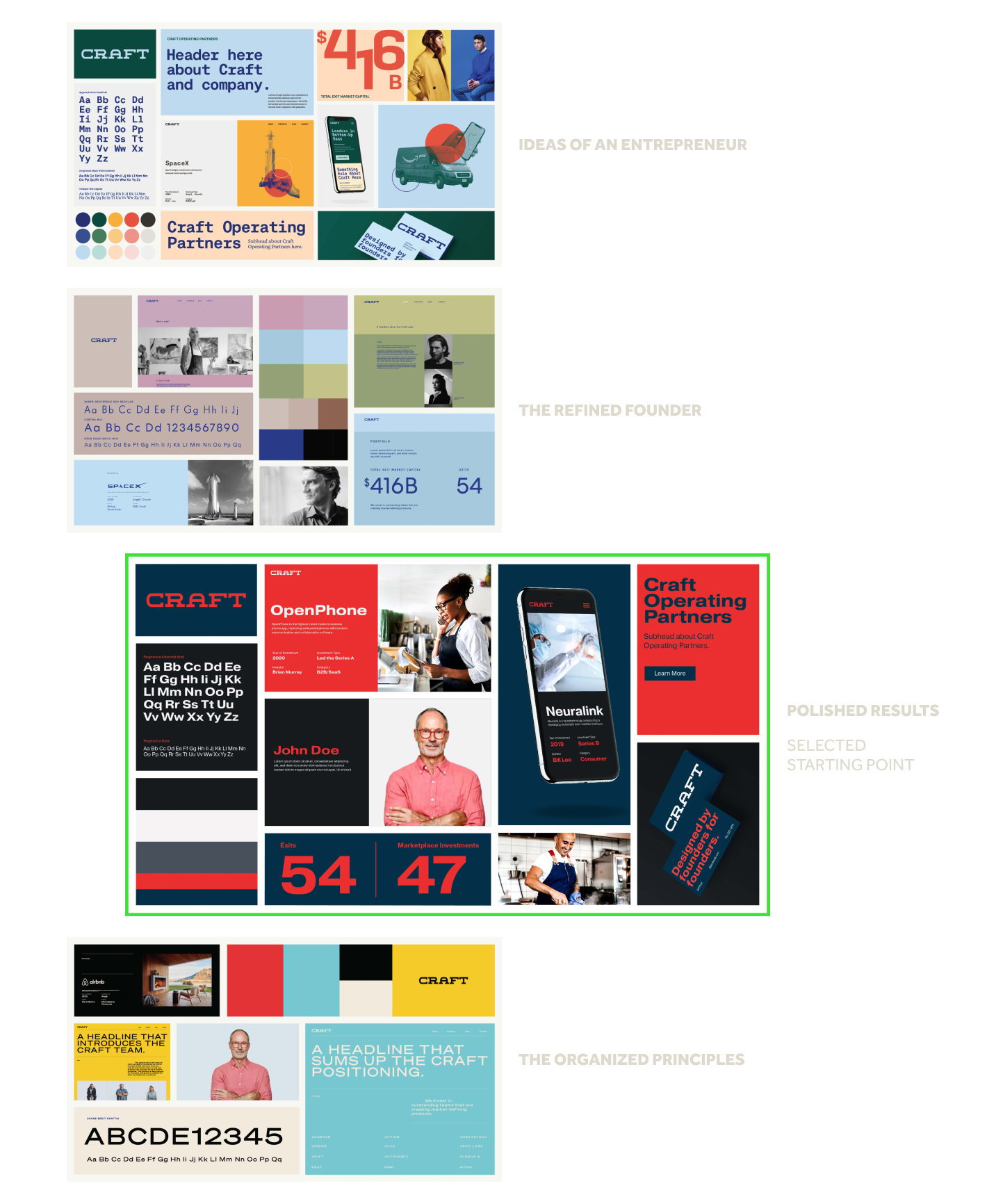
Multiple moodboards were designed, exploring a wide spectrum of visual solutions. Each one was inspired by a specific stage in Craft’s process a start-up would be in on their journey to their IPO.

As the brand identity was refined, choices were made to better communicate the on-hand process Craft provides instead of about polished results like the original selected moodboard's title suggested. These choices better helped Craft strategically position themselves among their competitors; their visual identity did more than communicate what a company ready for an IPO could look like but instead communicated the work and help provided to reach that stage.